
Choose an AI assistant above to request a concise summary of this cursive-reading guide.
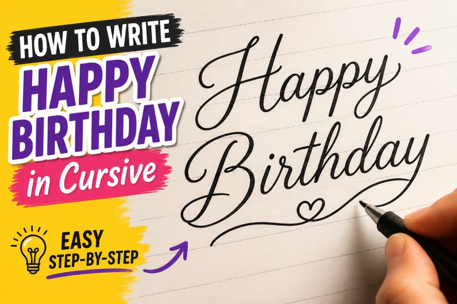
Learning how to write happy birthday in cursive is a useful skill for creating beautiful birthday cards, gift tags, invitations, posters, and social media designs. A handwritten cursive greeting often feels more thoughtful and personal than ordinary printed text.
The phrase may look complicated because it contains several connected letters, capital letters, loops, and repeated shapes. However, you do not need professional calligraphy experience to write it successfully. Once you understand how each letter is formed and how the letters connect, the entire phrase becomes much easier.
In this guide, you will learn how to write each word, connect the letters smoothly, avoid common handwriting mistakes, and decorate the final message. You will also find practice exercises that can help you create a neat and natural-looking birthday greeting.
What Does “Happy Birthday” Look Like in Cursive?
In cursive writing, most lowercase letters within a word are connected. Instead of lifting your pen after every letter, you use continuous strokes to move from one letter to the next.
The phrase contains two words:
- Happy
- Birthday
“Happy” begins with a capital H, while “Birthday” begins with a capital B. The lowercase letters inside each word should connect smoothly.
A basic cursive version looks different from printed handwriting because many letters include entry strokes, exit strokes, loops, and slanted lines. The exact appearance can vary depending on the handwriting style you choose.
Some writers prefer traditional school cursive. Others use modern cursive, brush lettering, or decorative calligraphy. Beginners should start with simple traditional cursive before trying more artistic styles.
Materials You Need for Cursive Practice
You do not need expensive tools to begin practicing. Basic writing materials are enough.
You can use:
- A lined notebook
- A pencil
- An eraser
- A ballpoint or gel pen
- Cursive practice sheets
- Tracing paper
- A brush pen for decorative lettering
A pencil is usually the best option for beginners because it allows you to erase mistakes. Once you feel comfortable with the letter shapes, you can move to pens, markers, or brush pens.
Lined paper is helpful because it allows you to control the height of your letters. It also keeps your words straight and makes it easier to maintain consistent spacing.
Understand the Basic Cursive Writing Position
Before writing the phrase, make sure you are sitting in a comfortable position. Good posture and paper placement can improve your handwriting.
Sit upright and keep your shoulders relaxed. Place your feet flat on the floor if possible. Hold the pen gently rather than gripping it tightly.
Right-handed writers can angle the paper slightly to the left. Left-handed writers may find it more comfortable to angle the paper slightly to the right.
Keep your wrist relaxed and move your hand gradually across the page. Avoid pressing the pen too firmly into the paper. Heavy pressure can make your strokes look uneven and cause your hand to become tired.
Your cursive letters should normally lean slightly to the right. The slant does not need to be dramatic, but it should remain consistent throughout the phrase.
Practice the Letters Before Writing the Full Phrase
Before joining everything together, practice the individual letters found in “Happy Birthday.”
The phrase uses the following letters:
- H
- a
- p
- y
- B
- i
- r
- t
- h
- d
Some letters appear more than once, especially p and a. Practicing these shapes separately will make the complete phrase easier to write.
If you are still learning basic formations, review this detailed guide on how to write cursive letters before practicing the full birthday message.
Pay special attention to the capital H, capital B, lowercase p, lowercase r, and lowercase y. These letters often cause difficulty for beginners because they contain loops, curves, or strokes that extend above or below the writing line.
How to Write “Happy” in Cursive
The first word contains five letters: H, a, p, p, and y.
Step 1: Write the Capital H
Start slightly below the top writing line. Create an upward stroke and form the first tall loop or curve of the capital H.
Bring the stroke downward toward the baseline, then create the second section of the letter. Depending on the cursive style, the capital H may have two tall loops or a large curved entrance stroke followed by a connecting line.
End the letter with a small exit stroke that moves toward the lowercase a.
The most important thing is to keep the H readable. Avoid adding too many loops when you are still practicing.
Step 2: Connect the Lowercase A
Begin the lowercase a directly from the exit stroke of the H.
Move upward slightly, curve back to form a small oval, close the oval, and then create a short upward exit stroke.
The lowercase a should stay between the baseline and the middle writing line. Try not to make it as tall as the capital H.
Step 3: Form the First Lowercase P
From the exit stroke of the a, move upward and then draw a long downward stroke below the baseline.
Bring the stroke back upward and form a small rounded loop or hump. Finish with an exit stroke that leads into the next p.
The lowercase p is a descending letter, which means part of it extends below the baseline.
Step 4: Write the Second P
Repeat the same movement used for the first p.
Try to keep both p letters similar in height, width, and slant. Since they appear next to each other, differences between them will be easy to notice.
However, they do not need to be perfectly identical. Natural handwriting usually includes small variations.
Step 5: Finish With the Lowercase Y
Connect the second p to the lowercase y.
Create a small upward curve, form the first part of the y, and return to the baseline. Then draw a descending stroke below the line.
Loop the descending stroke back upward and finish with a smooth exit stroke.
The final stroke of the y can be slightly longer because it ends the word. You may also use it as a decorative flourish, but keep the flourish controlled so it does not interfere with the next word.
How to Write “Birthday” in Cursive
The second word contains eight letters: B, i, r, t, h, d, a, and y.
Leave a clear space after “Happy” before starting the capital B. The space should be wide enough to separate the words without making them look disconnected.
Step 1: Write the Capital B
Begin near the top line and create a tall downward stroke.
Depending on your preferred cursive style, you can add an upper loop and a lower loop on the right side of the main stroke. The upper loop is usually smaller, while the lower curve is slightly larger.
Finish the capital B with an exit stroke that connects naturally to the lowercase i.
Capital B can be one of the most decorative letters in cursive. For beginners, readability is more important than decoration.
Step 2: Add the Lowercase I
From the B, create a short upward stroke and return to the baseline.
Finish with a connecting stroke toward the r. Do not dot the i immediately. It is usually easier to finish the word first and return to add the dot later.
Step 3: Form the Lowercase R
Move upward from the i and create a small curve or shoulder near the middle line.
Bring the stroke downward and finish with a connecting line.
The cursive r should remain small. A common beginner mistake is making it too tall or making it look like a printed r.
Step 4: Write the Lowercase T
From the r, move upward to form a tall stem. Bring the stroke down to the baseline and continue directly into the next letter.
Do not add the horizontal cross immediately. Complete the word first and return to cross the t afterward.
The lowercase t is usually taller than a, i, and r, but it may be slightly shorter than letters such as h or capital letters.
Step 5: Add the Lowercase H
Create a tall upward stroke and bring it back down to the baseline.
Without lifting the pen, move upward again to form the rounded hump of the h. Return to the baseline and finish with an exit stroke toward the d.
Keep the h narrow enough that the word does not become too wide.
Step 6: Form the Lowercase D
Begin the d by forming a small oval similar to the lowercase a.
After closing the oval, continue upward to create a tall stem. Bring the stroke back down and finish with a connecting line.
The tall part of the d should be similar in height to the h.
Step 7: Connect the Lowercase A
Create another small oval, close it, and finish with a short connecting stroke.
Try to make this a similar size to the a in “Happy.” Consistent lowercase letter sizes make the entire phrase look cleaner.
Step 8: Finish With the Lowercase Y
Form the first part of the y above the baseline and then draw the descending stroke below the line.
Loop the stroke back upward to finish the word.
Because this y ends the entire phrase, you can extend the final stroke into a gentle underline or flourish. Avoid making it so large that it distracts from the greeting.
Step 9: Add the Dot and Cross
After finishing “Birthday,” go back and dot the lowercase i.
Then cross the lowercase t with a light horizontal stroke.
Make sure the dot sits directly above the i and the t-cross is centered over the stem. These finishing details improve readability.
How to Connect the Two Words Properly
The letters inside each word should connect, but “Happy” and “Birthday” should remain separate.
After completing the final y in “Happy,” lift your pen. Move a short distance to the right and begin the capital B.
Do not connect the y directly to the B. Doing so can make the phrase difficult to read.
The amount of space between the words should be approximately equal to the width of one lowercase letter. You can adjust it based on your writing size.
If you are creating a card or poster, you may place the words on separate lines:
Happy
Birthday
This layout gives you more space for decorative capital letters and flourishes.
Tips for Writing Happy Birthday Neatly
Writing attractive cursive depends on consistency more than perfection.
Maintain a Consistent Slant
Most cursive letters lean slightly to the right. Try to keep the same angle from the capital H to the final y.
If some letters lean left while others lean sharply right, the phrase may look unbalanced.
You can draw light diagonal guidelines on practice paper to help control the slant.
Keep Letter Heights Consistent
Small lowercase letters such as a, i, and r should remain around the same height.
Tall letters such as h, d, and t should also have similar heights. Descending letters such as p and y should extend below the baseline by approximately the same amount.
Use Even Spacing
Letters should be close enough to appear connected, but they should not overlap.
Pay special attention to the two p letters in “Happy.” If they are too close together, they can look like one complicated shape.
Relax Your Grip
Holding the pen too tightly makes cursive writing stiff and uneven.
Use a comfortable grip and allow your fingers, hand, and wrist to move naturally. Take breaks if your hand becomes tired.
Write Slowly at First
Speed develops through repetition. Do not rush while learning the phrase.
Write each stroke carefully and focus on correct letter formation. As the movements become familiar, you will naturally begin writing faster.
Common Mistakes to Avoid
Beginners often make similar mistakes when learning how to write happy birthday in cursive.
Making Capital Letters Too Complicated
Decorative capital letters can look beautiful, but too many loops may make the H or B difficult to recognize.
Start with simple capital forms and add flourishes only after you can write the phrase clearly.
Forgetting to Connect Letters
Lowercase letters inside each word should flow together. Lifting your pen after each letter can make the result look more like italic printing than cursive.
Practice letter combinations such as “Ha,” “app,” “Bir,” “th,” and “day.”
Connecting the Two Words
“Happy” and “Birthday” should not become one continuous word. Leave a visible space between them.
Uneven Descending Strokes
The p and y letters extend below the baseline. Their descending strokes should not be extremely long or uneven.
Keeping similar descender lengths helps the phrase look balanced.
Adding Large Flourishes Too Early
Flourishes can improve a finished design, but they can also make handwriting messy.
Learn the basic phrase first. Add decorative strokes only after the letters are clear and correctly spaced.
Easy Practice Method for Beginners
A structured practice routine can help you improve faster.
Start by writing each important letter five times:
H H H H H
B B B B B
p p p p p
y y y y y
Next, practice short letter combinations:
Ha
app
ppy
Bir
irth
day
Then write each word separately five times.
After that, write the complete phrase slowly:
Happy Birthday
Repeat the phrase across one or two lines. Compare each version and identify areas that need improvement.
You can also trace a cursive example several times. Place tracing paper over the example and follow the strokes carefully. Once the movement feels natural, try writing the phrase without tracing.
Practicing for 10 minutes a day is often more helpful than practicing for one long session each week.
How to Make the Cursive Greeting More Decorative
Once you can write the phrase clearly, you can experiment with decorative styles.
Add a Simple Underline
Extend the final stroke of the y in “Birthday” beneath the word. Keep the line smooth and avoid crossing through the letters.
Thicken the Downstrokes
To create a calligraphy effect, add extra thickness to strokes that move downward.
This technique is sometimes called faux calligraphy. It works well with ordinary pens and does not require a brush pen.
Use a Brush Pen
Brush pens create thick downstrokes and thin upstrokes based on pressure.
Apply more pressure while moving downward and reduce pressure while moving upward. Practice slowly because brush lettering requires greater control than regular cursive.
Add Small Decorative Elements
You can place small stars, dots, balloons, hearts, flowers, or confetti around the phrase.
Do not add too many decorations. The words should remain the main focus.
Use Multiple Colors
Write “Happy” in one color and “Birthday” in another. You can also add shadows or outlines with lighter shades.
Choose colors that match the birthday theme, card design, or recipient’s preferences.
Using Cursive Happy Birthday in Different Projects
A cursive birthday greeting can be used in many creative ways.
Birthday Cards
Write the phrase on the front of a handmade card. Add the recipient’s name underneath for a more personal design.
Gift Tags
Use a smaller cursive version on a gift tag. Keep the letters simple so the phrase remains readable at a reduced size.
Party Invitations
Add the greeting to the top of a birthday invitation. Decorative cursive works especially well for elegant or formal celebrations.
Cake Toppers
Use your handwriting as a reference when designing a custom cake topper or printable decoration.
Posters and Banners
Write the phrase in large cursive letters and trace it with markers, paint, or digital design software.
Social Media Graphics
You can scan or photograph your handwritten greeting and place it on a digital background for birthday posts.
How Long Does It Take to Learn?
The amount of time required depends on your current handwriting skills and how frequently you practice.
Some people can learn a basic version in one practice session. Creating a smooth, consistent, and decorative version may take several days or weeks.
You do not need to wait until your handwriting is perfect before using it. A slightly imperfect handwritten message often feels more personal and meaningful.
Focus on making the phrase readable, balanced, and comfortable to write.
Frequently Asked Questions
Should the H and B be capitalized?
Yes. “Happy” and “Birthday” are normally written with capital H and B when used as a greeting or title.
Do I need to connect every letter?
Letters inside each word should generally connect. However, the words “Happy” and “Birthday” should remain separate.
Some modern cursive styles intentionally leave certain letters unconnected, but beginners should practice traditional connections first.
Can I write Happy Birthday with a regular pen?
Yes. A ballpoint, gel pen, pencil, or marker can be used. You only need a brush pen when you want thick and thin calligraphy-style strokes.
Why does my cursive look messy?
Messy cursive is often caused by writing too quickly, inconsistent spacing, uneven letter sizes, or gripping the pen too tightly.
Slow down and practice small letter combinations before writing the complete phrase.
Can left-handed people write cursive comfortably?
Yes. Left-handed writers may need to adjust the paper angle and hand position. Keeping the wrist below the writing line can help prevent smudging and improve visibility.
Is cursive the same as calligraphy?
No. Cursive is a connected handwriting style designed for smooth and efficient writing. Calligraphy focuses more on artistic letter shapes, controlled pressure, and decorative composition.
However, cursive can be used as the foundation for simple calligraphy.
Final Thoughts
Learning how to write happy birthday in cursive becomes much easier when you divide the phrase into individual letters and short connections.
Begin by practicing the capital H and B. Then work on the lowercase letters, especially p, y, r, h, and d. Once the letter shapes feel comfortable, connect them slowly to form “Happy” and “Birthday.”
Keep your slant, spacing, and letter heights consistent. Avoid adding complicated flourishes until the basic phrase is clear and readable.
With regular practice, you will be able to create a smooth cursive birthday greeting for cards, invitations, gift tags, posters, and many other personal projects. The handwriting does not need to be perfect. A clear and carefully written message will already make the birthday greeting feel more special.

Comments
0 responsesNo comments yet. Be the first to share your thoughts.