
Choose an AI assistant above to request a concise summary of this cursive-reading guide.
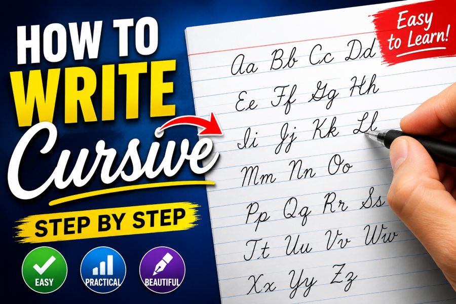
Learning how to write cursive letters can make handwriting faster, smoother, and more personal. Unlike printed letters, cursive writing connects many letters within a word, allowing the pen to move naturally across the page without stopping after every character.
For beginners, cursive may initially look complicated. Some letters have loops, others begin below the writing line, and several uppercase forms look very different from their printed versions. However, cursive becomes much easier when you stop thinking of it as 26 separate letter designs and begin seeing it as a small collection of repeated strokes.
Curves, loops, upward lines, downward strokes, and connecting tails appear throughout the cursive alphabet. Once these basic movements become familiar, you can use them to form letters, connect words, and develop a comfortable handwriting style.
This guide explains how to write cursive letters step by step, from basic pen control to complete sentences.
What Is Cursive Writing?
Cursive writing is a handwriting style in which letters are formed with flowing strokes. Many letters within a word are connected, reducing the number of times the writer needs to lift the pen from the paper.
The word “cursive” comes from a term associated with running or flowing. That description matches the movement of cursive handwriting because the letters appear to run together across the page.
Cursive writing can be used for:
- Personal signatures
- School assignments
- Letters and greeting cards
- Journaling
- Note-taking
- Invitations
- Creative writing
- Handwritten artwork
Although digital communication is common, cursive remains useful. It can help people write notes quickly, understand older handwritten documents, and create writing that feels more personal than typed text.
What You Need to Start Writing Cursive
You do not need special calligraphy equipment to learn cursive. A few simple materials are enough.
Use lined paper so that you can control letter height and keep words straight. Paper with a dotted middle line can be especially helpful because it shows where lowercase letters should reach.
Choose a pen or pencil that moves smoothly without requiring too much pressure. Beginners often find pencils easier because mistakes can be erased. A gel pen or ballpoint pen may feel better once the basic movements become comfortable.
You may also use cursive alphabet worksheets. These provide letter models, stroke directions, and dotted forms that can be traced.
Make sure your writing area is comfortable. Sit at a desk or table where your arm can move freely. A cramped position can make your handwriting tense and uneven.
How to Hold Your Pen for Cursive Writing
A relaxed pen grip helps produce smooth cursive strokes. Hold the pen between your thumb and index finger while allowing it to rest against the side of your middle finger.
The pen should feel controlled but not squeezed. Gripping too tightly can cause hand fatigue and make your letters look stiff.
Keep your wrist relaxed and allow your fingers, hand, and forearm to work together. Small letters may rely more on finger movement, while longer words may require your hand to move across the page.
Place the paper at a slight angle instead of keeping it completely straight. Right-handed writers often turn the top of the paper slightly to the left. Left-handed writers may prefer turning it slightly to the right.
Experiment with the angle until your hand can move without covering the letters you just wrote.
Learn the Basic Cursive Strokes First
Before practicing the entire alphabet, spend time learning the basic strokes used to form cursive letters.
The Upward Stroke
The upward stroke usually begins at the baseline and moves diagonally toward the middle line. It appears at the beginning of letters such as lowercase i, u, w, and t.
Keep the stroke light and smooth. Avoid drawing it too vertically.
The Downward Stroke
The downward stroke moves from the top or middle of a letter toward the baseline. Letters such as l, h, t, and d include a downward movement.
Try to keep downward strokes consistent in direction and length.
The Undercurve
An undercurve begins near the baseline, moves upward, curves down, and finishes with a connecting tail. It is commonly used in letters such as i, u, and w.
Practicing rows of undercurves can improve rhythm and spacing.
The Overcurve
An overcurve begins by moving upward before curving over and down. It appears in letters such as m, n, and h.
The curve should remain rounded instead of forming a sharp corner.
The Loop
Loops appear in letters such as e, l, h, b, f, and j. Some loops rise above the middle line, while others extend below the baseline.
Keep the inside of each loop open enough to remain visible.
The Oval
The oval is important for letters such as a, c, d, g, o, and q. It resembles a small, tilted circle drawn without lifting the pen.
A well-formed oval helps many cursive letters look balanced and readable.
How to Write Lowercase Cursive Letters
Lowercase letters are used more frequently than uppercase letters, so they are usually the best place to begin.
Instead of practicing the alphabet only from a to z, group letters according to their similar stroke patterns.
Cursive Letters With an Undercurve
Start with lowercase i, u, w, and t. These letters use similar upward and downward movements.
For a lowercase cursive i, begin at the baseline. Move upward toward the middle line, curve back down to the baseline, and finish with a short connecting stroke. Add the dot after completing the word.
The letter u uses two related undercurve movements. Keep both sections similar in height.
The letter w is formed with additional repeated curves. Make sure the bottom points remain rounded rather than sharp.
The lowercase t resembles a taller version of i. Add the crossbar after writing the word or letter group.
Practice words such as:
- it
- win
- twin
- unit
- wait
These simple combinations help you practice repeated upward strokes.
Cursive Letters With Overcurves
The lowercase m, n, r, and h contain overcurve movements.
Begin lowercase n with an upward entry stroke. Move down to the baseline, return upward in a rounded curve, and finish with a connecting tail.
The lowercase m uses a similar movement but contains an additional rounded section.
For lowercase h, begin with a tall loop or upward stroke reaching the top line. Move down to the baseline and create a rounded hump similar to lowercase n.
Practice words such as:
- him
- man
- rain
- warm
- mine
Pay attention to the difference between m and n. If the humps are too narrow or uneven, the letters can be difficult to identify.
Cursive Letters Based on Ovals
Lowercase a, c, d, g, o, and q are based on the oval shape.
To write lowercase c, begin slightly below the middle line and curve backward, down, and around. Leave the right side open and finish with an upward connecting stroke.
For lowercase o, close the oval and create a small exit stroke near the upper-right side.
The lowercase a begins like o, but a downward stroke is added on the right side before the exit tail.
The lowercase d uses the same oval beginning as a, followed by a tall upward stem.
Letters g and q extend below the baseline. Keep their lower loops or tails clear so they do not resemble other letters.
Practice words such as:
- dog
- goal
- code
- good
- road
Try to keep every oval similar in size and slant.
Cursive Letters With Loops
Lowercase e, l, b, f, j, and k include noticeable loops or loop-like movements.
The lowercase e begins with a short upward stroke that curves into a small loop. Make sure the loop remains open.
For lowercase l, begin at the baseline and move upward toward the top line. Create a loop and return with a long downward stroke.
The lowercase b also begins with a tall loop. After returning to the baseline, form a rounded shape on the right before creating the connecting tail.
The lowercase f can be more difficult because it may extend both above and below the main writing area. Practice it slowly before adding it to words.
Use practice words such as:
- life
- blue
- feel
- file
- belief
Other Lowercase Cursive Letters
Some letters have more individual shapes and may need separate attention.
Lowercase s may look very different from printed s. It usually begins with an entry stroke, curves inward, and exits from the lower-right side.
Lowercase p begins with an upward stroke before moving below the baseline and returning to form the rounded section.
Lowercase x uses one flowing form followed by a second crossing stroke.
Lowercase z often includes a curved top and a lower loop that extends beneath the baseline.
Do not worry if these letters take longer to learn. Practice them individually before using them in complete words.
How to Write Uppercase Cursive Letters
Uppercase cursive letters often have more decorative shapes than lowercase letters. Some closely resemble printed capitals, while others use large loops and curves.
Start with capitals that feel familiar, such as C, E, L, O, and U. Then move to more complex forms such as G, Q, S, and Z.
When practicing uppercase cursive letters, focus on three things:
- Keep the letter within the correct height.
- Make the main shape large enough to distinguish it from lowercase writing.
- Leave enough space before connecting or beginning the next letter.
Not every uppercase cursive letter connects naturally to the following lowercase letter. Depending on the handwriting style, you may lift the pen after forming the capital and begin the next letter separately.
Practice writing names because they naturally combine uppercase and lowercase forms. Examples include:
- Alice
- Daniel
- Emma
- James
- Olivia
- William
Write each name slowly before trying to increase your speed.
How to Connect Cursive Letters
Connecting letters is one of the most important parts of learning how to write cursive letters.
Most lowercase letters finish with an exit stroke. This line leads directly into the entry stroke of the next letter. The connection should look natural rather than added as a separate line.
For example, when writing the word “cat,” the exit stroke from c flows into a. The exit stroke from a then continues into t.
Avoid lifting your pen between letters unless the connection would make the word unclear. You can add dots, crosses, and certain marks after completing the entire word.
Some combinations are easier than others. Begin with words containing simple connections:
- cup
- day
- home
- rain
- time
Then practice more difficult combinations:
- bright
- school
- quick
- extra
- flower
Look closely at where one letter ends and the next begins. A poor connection can make two letters appear as one unfamiliar shape.
How to Maintain a Consistent Slant
Most cursive handwriting leans slightly to the right. The exact angle is less important than consistency.
If some letters lean right, others lean left, and others remain vertical, the writing may appear unbalanced.
Draw several light diagonal guidelines across a practice page. Use them as a reference while writing rows of letters. Try to align tall strokes, loops, and downward lines with the same angle.
Do not force an extreme slant. A small, natural angle is easier to maintain and read.
Left-handed writers should not feel required to copy the exact slant used by right-handed writers. Comfort and readability matter more than following one rigid style.
How to Improve Cursive Letter Spacing
Good spacing makes cursive handwriting easier to read.
Letters within a word should be close enough to appear connected but not so close that their shapes overlap. Spaces between words should be wider and clearly visible.
Use the width of a lowercase o as a rough guide. The space between words can be approximately the width of one small letter.
When practicing, write slowly and check whether the gaps are consistent. Over time, spacing will become more automatic.
If your words look crowded, lengthen the connecting strokes slightly. If the letters look disconnected, shorten the distance between them.
A Simple Cursive Practice Routine
Consistent practice is more effective than writing for a long time once a month. Spend 10 to 20 minutes practicing several days per week.
Begin with two minutes of warm-up strokes. Write rows of loops, ovals, undercurves, and overcurves.
Next, choose three or four lowercase letters from the same movement group. Write each letter slowly several times.
After that, practice short words containing those letters. Pay attention to connections, size, spacing, and slant.
Finish by writing one or two complete sentences.
A sample practice sentence is:
“The quick brown fox jumps over the lazy dog.”
This sentence contains every letter of the English alphabet, making it useful for handwriting practice.
You can also copy a short paragraph from a book, write your daily schedule, or keep a handwritten journal.
Common Cursive Writing Mistakes
One common mistake is trying to write too quickly before learning the correct shapes. Speed should develop naturally after the movements become familiar.
Another mistake is gripping the pen too tightly. Excess pressure creates stiff lines and can make your hand tired.
Inconsistent letter size is also common. Tall letters such as b, d, f, h, k, l, and t should reach a similar height. Small letters such as a, c, e, i, m, n, o, r, s, u, v, w, and x should remain around the middle line.
Letters with descenders, including f, g, j, p, q, y, and sometimes z, should extend below the baseline in a controlled way.
Beginners may also focus too much on decoration. Large loops and dramatic flourishes can reduce readability. Learn clean, simple forms before adding personal style.
How Long Does It Take to Learn Cursive?
The amount of time needed depends on your age, existing handwriting habits, and practice schedule.
Many beginners can learn the basic lowercase alphabet within a few weeks. Writing complete words smoothly may take longer. Developing comfortable, consistent cursive handwriting often requires several months of regular use.
Progress does not need to be perfect. Your writing may look uneven while your hand learns unfamiliar movements.
Compare your current handwriting with an older practice page instead of comparing it with someone else’s polished work. Small improvements in spacing, shape, or control are signs that your practice is working.
How to Read Difficult Cursive Handwriting
Learning to write cursive can also make handwritten documents easier to read. Once you understand common letter forms and connections, you can recognize where one character ends and another begins.
When reading unclear cursive, examine the entire word instead of focusing only on one letter. Sentence meaning can also help you identify uncertain characters.
Look for tall letters, lower loops, dotted letters, and crossed t shapes. These features can narrow down possible words.
A cursive reading tool such as Cursive Reader Pro may also help when you are working with handwriting that is faded, unfamiliar, or difficult to interpret. Clear images, good lighting, and straight page alignment can make handwritten text easier to examine.
Frequently Asked Questions
Is cursive writing difficult to learn?
Cursive can feel difficult at first because the letters connect and use unfamiliar movements. It becomes easier after you practice basic strokes and group similar letters together.
Should beginners learn uppercase or lowercase cursive first?
Beginners should usually start with lowercase letters because they are used more often and contain many repeated stroke patterns. Uppercase letters can be added after the lowercase alphabet feels comfortable.
Do all cursive letters need to connect?
Most lowercase letters connect within a word, but some uppercase forms and personal handwriting styles may require the pen to be lifted. Readability is more important than forcing every letter to connect.
Can adults learn how to write cursive letters?
Yes. Adults can learn cursive through the same process used by younger students: basic strokes, letter groups, word connections, and regular practice.
How can I make my cursive handwriting neater?
Write slowly, relax your grip, use lined paper, maintain consistent letter height, and practice similar letters together. Neat handwriting develops through controlled repetition.
Is cursive faster than print handwriting?
Cursive can become faster because connected letters require fewer pen lifts. However, beginners may write more slowly until the movements become automatic.
Final Thoughts
Learning how to write cursive letters begins with simple movements rather than complete words. Practice upward strokes, curves, ovals, and loops before working through lowercase and uppercase letter forms.
Once individual letters feel comfortable, focus on connections, spacing, size, and slant. Write slowly enough to maintain control, and gradually increase your speed as the movements become familiar.
Your cursive handwriting does not need to look exactly like a worksheet. A personal style will develop naturally as long as the letters remain clear and readable.
With regular practice, you can build smoother handwriting, create a consistent signature, take faster handwritten notes, and read cursive text with greater confidence.

Comments
0 responsesNo comments yet. Be the first to share your thoughts.